At a Loss for Words
More visuals, fewer words: the new artistic renaissance in Canadian magazines and newspapers
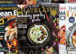
On a late wintry afternoon, Dave Donald zigzags through the magazine aisles at the Indigo bookstore in downtown Toronto. Chatelaine‘s former senior associate art director points to New York magazine. “There’s a lot of buzz around this,” he says. Then he looks for Chatelaine and Canadian Living, commenting, “Must be in family mags.” Sure enough, he twirls around and finds both magazines, side by side in the family section. “These magazines are very aggressive at luring in their readers,” he continues. “There’s not much else in the Canadian English market in this category. You can actually buy the things in the magazine. That’s why they’re successful.” He starts flipping through a copy of Canadian Living and is surprised to discover it went through a refreshment in October 2004. “It looks like Chatelaine did before its relaunch,” he says. “The type is a bit different, but it’s not a very contemporary look.”
Speaking of not very contemporary, one of Canada’s best-known titles, Toronto Life, finally revamped its look for the April 2005 issue. “For the last 10 years, it’s bothered me,” Donald says. “There’s not a lot of contrast. It’s neatly designed, but it’s not making me excited.” Turning to me, the self-confessed magazine junkie asks, “What’s the first thing you see when you look?”
“Truthfully? The picture.”
Donald proceeds to give an explanation of Gestalt, a school of psychology that believes primates tend to organize perceptions into wholes. He says recognizing this idea is crucial to understanding how readers absorb words and visuals. Although the eye notices the picture first, it processes the entire magazine package as a unified entity.
Luring and holding the reader’s interest with these wholes is exactly what an art director tries to achieve with every spread. “We’re as important, if not more important, than the editor,” says Georges Haroutiun, art director and publisher of Applied Arts magazine and a former freelance designer who’s worked on numerous Canadian publications, including Homemakers, Elm Street, and Images. “We get readers into the story.”
Haroutiun believes art directors aren’t considered as important as editors, but this view doesn’t reflect reality. The public’s level of design knowledge has increased significantly in the past two decades, and readers have become much more visually sophisticated. Editors need at least some design background to compete effectively. “Today’s magazine generation is presumed to not be real readers,” he says. “Content becomes secondary. Smaller, shorter stories and more visuals are easier for people to relate to.”
Packaging has always been a factor for success in the print industry, but the trend at magazines and newspapers is heading toward fewer words, more white space, more dramatic spreads, and more bits and bites of editorial information. The shift has spurred publishers to refresh designs, or sanction outright facelifts, with increasing frequency. Thanks to inexpensive, robust technology, redesigning has become easier and faster. These factors give art directors more clout.
Newspaper executives, once allergic to visual change, have caught the bug in a big way. Donald says newspaper art directors didn’t obsess over design until 1998, with the launch of the National Post. If they did, they were mostly concerned with special projects like The Globe and Mail inserts in the 1980s. “Now design people are more concerned about the design of editorial pages,” he says. Newspapers are not only designing more like magazines, but also presenting stories in a more visual way. This means they’re being redesigned and refreshed as often as magazines. The Toronto Sun got its makeover last year. The Globe and The Toronto Star have started deploying striking large-point type, words, and numerals to overpower the reader. The most radical revamp of all occurred at the Star this past January. It overhauled its Sunday edition to the point where, except for its classifieds, the paper looked nothing like the other days of the week. Some see the Sunday edition as a portent of what’s to come at the country’s largest daily.
Redesigns have become the extreme makeover reality show of print journalism, with no publication wanting to look dated. Designers still take direction from publishers and editors, of course, but so long as “staying fresh” remains the mantra, designers are the de facto leaders of change at magazines and newspapers.
I meet Carol Moskot, Toronto Life‘s recently installed art director, at the St. Joseph Media building in downtown Toronto. In early November, the week before, I had emailed her some questions, and she’s printed them out on a piece of paper to read in front of me. She responds to each question briskly. I ask if she can answer a few more questions. She glances at her watch. “You’re busy and don’t have much time,” I offer.
“Five minutes,” she replies.
Moskot has been at Toronto Life since September. I want to know whether she’ll be making changes. “When will readers get to see your mark? December?”
“Yes,” replies Moskot.
“Will there be a redesign?” I ask.
“You tell me,” she says.
I ask if her changes will be considered a redesign. Silence. There’s a smirk on her face. “You’ll see the redesign when it comes out.”
At 39 years old, Toronto Life is an established city magazine. It has held fast to its solid, if unspectacular, design since editor John Macfarlane took the reins again in July of 1992. Last December, Macfarlane announced to media that a new look was scheduled for April 2005. It was no real surprise, since Moskot had arrived in September, 12 weeks prior to the announcement. Sandra Latini, with 14 years of service, had been the longest running art director in the magazine’s history. “It was a mutual decision with the editor,” says Latini. “There is also a new art department now.” She suspected Toronto Life would copy the latest format ofNew York and add more visual features. Upon inspection, the newly designed Toronto Life is better organized, but still maintains its style.
Written features have always been one of its mainstays, but Macfarlane thinks it was time for a reassessment. “It had gotten tired-looking and predictable,” he says. The boldest change was the removal of the eye-catching, red-rectangle logo that had been with the magazine throughout Latini’s tenure. Macfarlane says the rectangle was comfortable, but the logo has been liberated, and he’s confident readers will “recognizably connect” with it.
Another prominent title, Canadian Living, went through the same kind of refinement in October 2004. Michael Erb, creative director for both Canadian Living and Homemakers, calls it a “refreshment,” saying he didn’t want to “shock the reader.” The basic structure remained the same, but subtle changes were made, for example, to the “sampler pages” (single pages with specific content used to reflect different areas in the magazine, including health, family, and food) in the front of the book. The health sampler became “Just Ask” – experts answering readers’ questions. Erb says the team wasn’t overly critical of content, but thought the serif font wasn’t strong enough for display. They wanted to make sure the editorial environment could hold its own against splashy-looking advertising.
Such attention to design hasn’t always consumed the minds of art directors and editors. The magazine industry in Canada has watched a slow and steady evolution explode in the past generation with technological innovation and packaging concerns. The first magazine in Canada, published in 1789, had the unwieldy moniker The Nova Scotia Magazine and Comprehensive Review of Literature, Politics, and News. It looked like a newspaper, except smaller. It wasn’t until a hundred years later – with the advent of engraving firms, illustrations, and cartoons – that decorative typography started to become widely available. In the 1880s, the art department of the Toronto Globe joined with the Toronto Lithographing Co. to produce advertising posters and specialty publications. Illustrators began appearing in newsrooms in large numbers by the early 20th century. Most North American periodicals started to introduce colour around this time, but few newspapers had regular colour until USA Today introduced it on a mass scale in 1982. Except for Lifemagazine, most magazines were black with spot colour. Canadian magazines like Chatelaine didn’t introduce colour until the 1980s.
From the widespread introduction of four-colour reproduction to full digital capability, much has changed in one generation. Technology makes it faster and easier to produce design. “Automatic cars are easier to drive than standards, so more people drive,” says Haroutiun, “but that doesn’t mean they’re better drivers.” It also takes away some of the mystery surrounding the vocation. “Before, amateurs couldn’t be in the business. Now, you just click a button on the computer and it’s there.” This has led to more in-house redesigns and less dependence on consultants.
“Staying fresh” has put a new twist on the relationship between editor and art director. And although that relationship has intensified in recent years, it has always been prickly. Stevie Cameron, who was the founding editor of Elm Street from 1996 to 2000 (the magazine folded in 2004), says an editor’s relationship with her art director is, by nature, intense. “We argued and she usually won,” she says, recalling her experience with art director Martha Weaver. “She protected the visual side and I protected editorial, but I realized that it had to look good or no one was going to read it.”
One incident Cameron vividly remembers was a battle she says she lost to the fashion editor. Two pages of the magazine were devoted to a full-colour bleed of a pair of flip-flops. “They said it was a beautiful design, but who the hell cares about a pair of shoes? It looked like a free ad for Aldo,” says Cameron.
There isn’t always a failure of communication between editors and art directors. Haroutiun recalls one incident about conjuring a visual for a story about child abuse. “I envisioned a close-up photo of a child,” he says, “with a thorn crown bleeding on his head and a sad face. This is child abuse to me. This is symbolic. The publisher wanted a beaten child crying in the hospital. The literal translation was just corny.” In the end, Haroutiun’s vision won. “A good editor,” he says, “will back you up.”
The real reason a publication chooses to redesign often has nothing to do with modifying editorial content. “When publications begin to lose ground, an obvious way to make that impact is a redesign,” says Haroutiun. “It’s like readdressing someone.” Regular readers notice when editorial content changes, but advertisers pay attention to major visual changes. Often Haroutiun sees a lot of shuffling around rather than a well-thought-out process.
Freelance designer Tony Sutton of News Design Associates Inc., who has consulted for many newspapers worldwide, including the Chronicle-Herald in Halifax, and was design director for the Globe in 1990, says this problem has hit newspapers particularly hard. In the ’80s and ’90s, they achieved the goal of appearing clean and tidy, he says, but forgot what to say. “Newspapers didn’t become dynamic and interesting,” he says on his website. “They became mind-numbingly boring. Readers responded by cancelling subscriptions and watching tabloid TV instead.” Too often, a redesign is a substitute for thought on the part of editors. Sutton admits it can be part of the answer, but it’s not the entire solution. Many think of art direction as “airy-fairy,” and the fear that text will lose out to visuals often reduces to the war cry: “We’re losing stories!”
There should be no problem understanding the new visual reality at the Sun. Editor-in-chief Jim Jennings, who took charge in September 2004, is one of the first newspaper editors with a strong design background. His master’s program in journalism emphasized picture editing and graphic design. In 1996, he was president of the Society for News Design, an international organization for those concerned with both journalism and design. He has also consulted for more than 200 newspapers worldwide on issues such as design, readership, and newsroom structure. “Although content still comes first,” he says, “successful papers with growing circulation are those that think about presentation, layering, and visual storytelling.”
As an example of thinking about stories visually, Jennings enthusiastically applauds the Globe‘s special China edition, which ran October 23, 2004. The fat Saturday paper was devoted to a massive investigation of that country; even sections like Sports led with China-related features. “It was the epitome of what journalism should be and can be,” he says.
What Jennings wants to bring to the Sun is the idea that coordination between art and editorial means not simply designing packages of news and entertainment, but also physically bringing together art and editorial in the newsroom. Keeping the two separate implies that the thinking behind what a story is – and can be – is old thinking.
That kind of old thinking dies hard. The pace of technological change in art direction has accelerated in the past generation, yet designers have struggled for respect in newsrooms. Keith Branscombe, who worked at the Star in the ’80s and ’90s as assistant managing editor of graphics, recalls the challenges. “It was a rough beginning,” he says. “The editors felt threatened by us. They thought the art department was full of morons and renamed it ‘Disneyland.'” In terms of being in the loop, he remembers being “far down the food chain.” Visuals consisted of simple charts or bunnies at Easter. They were a crutch – “a peripheral concern” – not an integral part of selling the story to readers.
The Globe‘s Pratt says newsrooms now feature a certain amount of integration. One team works by the business desk and another by the news desk, but generally, design works separately from editors and reporters. The industry is in transition and has been since the Post came on the scene seven years ago, yet many editors balk at the greater emphasis on presentation and design. “There is a strong resistance at some papers,” says Pratt. “People see the need for it, but it’s not always well received, as if it means we are dumbing down.”
“It’s like asking a writer after the interview to do a Q & A instead,” Pratt continues. “That changes the approach to the interview. When you ask writers and editors to think about the story visually before they begin to gather information, it changes everything. It can be frustrating.”
The Star‘s assistant managing editor of design, Carl Neustaedter, has seen conflicts result from this lack of communication. For example, sidebars called Quick Fact Boxes were developed as part of the paper’s 2002 redesign. They were to run at the end of a story and deliver information at a more accessible level for readers. It was a good idea, but the writers didn’t know they were supposed to obtain the extra information.
No communication breakdown occurred January 16, 2005, when the Sunday Star‘s radical facelift was unveiled. Neustaedter says the designers tried “to learn a lot from magazines and how they package themselves.” Sunday Star editor Alison Uncles agrees, describing the paper as a “hybrid magazine.” They believe it is the first North American broadsheet in full colour. It’s too early to tell whether advertising or circulation will respond, says Neustaedter.
For those who think the new Sunday Star is a Trojan horse that will become the model for the main paper’s design, Neustaedter says forget it – the faster flow of news information during the week demands a different treatment. He then qualifies this conviction by saying the paper will pay greater attention to packaging.
The reader absorbs packaged information in a way explained by Gestalt theory, which might also explain the success or failure of newsstand sales, but it’s not the only reason to pick up a magazine. As design consultant Dave Donald roams the magazine racks at Indigo, he’s lured not only by the striking images. He’s also gravitating towards titles he already reads and enjoys, and he’ll do that even before he judges the cover. “I usually go for content,” he admits, explaining the other side of the equation. “That’s how most readers approach a magazine, but it needs to be shown in an appealing way.” Donald acknowledges that newspapers have made inroads in the visual-appeal department. “The major papers in Toronto present content better than 10 years ago,” he says. “This has put pressure on news magazines to look more current.”
Print publications can no longer afford to rely solely on strong editorial content or a striking cover for success. They must present stories using visuals as an equal element. It’s become an issue of overwhelming concern, resulting not only in decreased editorial content and frequent redesigns, but also imaginative new ways of presenting stories to visually savvy readers. The fight between art directors and editors isn’t over – it’s just beginning, and editors know it.
“This is a disagreeable thing to a lot of editors, but it’s the way a lot of readers operate,” says Pratt. “It’s a fact of life and we must deal with it.”
This is a joint byline for the Ryerson Review of Journalism. All content is produced by students in their final year of the graduate or undergraduate program at the Ryerson School of Journalism.


