How Designers Think
The Globe and Mail's visual evolution
Innovation in Newspaper Design
American newspapers have long been the paragon of newspaper design, but in the past decade many have “lapsed into a lethargy that’s made them homogenized, sanitized and deca einated,” said Mario Garcia, in a 1996 American Journalism Review article. Today many are shackled to a bottom-line mentality as a result of cutting costs to survive instead of trying to innovate; they practice a no-change-is-good-change philosophy and then wonder why advertisers and readers are disappearing.
Newspaper design in Canada is a bit more optimistic. Intense competition between the Toronto Star, The Globe and Mail and the National Post, makes art directors take risks. There is no room for complacency, and that is what makes us leaders in design, says Gayle Grin, the National Post’s managing editor of design and graphics and former president of the Society for News Design (SND).
This year at SND’s 32nd annual Best of Newspaper Design Creative Competition, Portugal’s i newspaper received the World’s Best-Designed Newspaper award.
Canadian newspapers also received multiple awards for their designs:
- The National Post won 32 design awards, and for the third consecutive year its design was named among the top five in the world by SND (next to the Los Angeles Times, the Washington Post, Times of Oman in the Middle East, and The New York Times)
- Montreal’s La Presse won 26 awards
- The Toronto Star won 14 awards
- The Globe and Mail won six awards, one being an SND Award of Excellence for its 2010 redesign
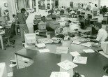
I stand next to Adrian Norris, The Globe and Mail’s managing editor of design and presentation. Norris, with a cardboard cup of cafeteria coffee in hand, gives me a brief tour of his second home: the redesign room, a closet-like visual spectacle of an offi ce tucked in the corner of the third floor. It’s hidden away from the features section and the quiet, open-concept, conservatively corporate cubiclemaze that is the Globe newsroom.
Inside, a freakishly levelled and evenly spaced jumbo grid of full-colour pagelayout proofs and typography experiments cover the walls; the entire paper is dissected like a frog, its organizational skeleton and journalistic organs magnified, taped-up and studied for their functions. The side table holds a cache of thepast weeks’ papers, some scribbled on with circle and arrow Sharpie doodles:autopsies of disfi gured designs. Here, Norris with co-designers Devin Slater and Jason Chiu—their noses pressed to the Mac screen—spent most hours of most days for the last 18 months researching, planning, prototyping, designing and editing theGlobe’s 2010 magnum opus: “Proudly Print” redesign.
I ask Norris about fonts, an infallible conversation-starter when interviewing designers. He points to a piece of paper outlining the Globe’s signature Pratt Pro typeface. Days were spent deliberating over the precise combination of weight, height, curve and negative space for each letter of each italic, outline, bold and extra bold variations. “Everything was thoroughly thought through, from the font selection to the colour palette,” says Norris. “The design is not trying to do anything showy. It is about conveying information in a pure way.”
And then I say something that makes most newspaper designers cringe: “There is always that argument that design makes things look prettier.” Norris’s eyes narrow.
Thirteen days earlier, on October 1, 2010, the Globe launched the newfangled national newspaper-magazine hybrid; its latest look features a trimmed page-size, colour on every page, emphasis on photography and graphics, and certain sections printed on semigloss paper stock. In his opening column, editor-in-chief John Stackhouse called it “the most significant redesign in the Globe’s history.” His reason for changing the look of the 167-year-old rulingclass broadsheet: “We’re evolving because we’re confident in the future of the printed word—and the power of insight and ideas.” Criticism of the redesign disseminated. Some readers approved: “Love the print redesign…thanks for not standing still, but having the courage to adapt and evolve based on the needs of your readers.” Many hated it: “Style over substance,” and “To think a huge team of people approved this design change is unbelievable. I shudder to see the print version in the a.m.” Journalists were critical: “The new tarted-up, glossy, colour Globe and Mail is many things, but it is not a real ‘newspaper.’ It has been ‘dumbed-up’ and robbed of much of its news content.” Academics were skeptical: “The Globe’s ringing endorsement of the future of print is charming, but deluded.”
Opinions abounded. It was as if both the general and journalistic populace squeezed their heads into common stock black turtlenecks and became pseudo designers. Missing from the media discourse were the explanations and insights from the newspaper designers themselves.
So, just how do newspaper designers think?
“Good newspaper design should be invisible,” Norris says in his English accent. Design exists as the communication framework, a containing vessel through which people see, engage and understand the content it holds. It is the journalistic “Show, don’t tell!” mantra, literally.
“There is nothing superficial about it,” rebukes Norris. “People think it is change for change’s sake, which it is absolutely not.”
I sense an underlying exasperation, perhaps the result of trying to explain to journalists, like myself, that newspaper design is not just a decorative afterthought.
This isn’t the first time the Globe has changed its look. Over the past 21 years it has undergone five major redesigns, directed by three British visual experts: Tony Sutton, the redesign renegade in 1990; David Pratt, the design philosopher in 1998, 2000 and 2007; and Adrian Norris, the newsroom conductor in 2010. All have played a key role in strengthening the clout of modern visual thinking at the Globe, a far cry from its grey, boring past when the majority of newsroom denizens referred to design as mere “ornamentation,” remembers Pratt. “This made me very angry. I told the person so and they got angry too.”
In the early days, design was not part of the editorial process but operated as a ghettoized subsidiary. Journalists were separate from the production of the newspaper they created content for; they wrote their articles, dropped their copy on their editors’ desks, and then the revised articles, with a roughly sketched layout, would be “transferred along a pneumatic tube into the bowels of the building…[where] gangs of two-fingered typesetters along with their thuggish leather-aproned compositor-cum-psychopath pals…would miraculously turn it into a newspaper. And that, more or less, was that, give or take a few expletives or two along the way,” wrote Sutton in a 1992 article titled “The Perils of Pagination.”
Editors at the time took it upon themselves to control what they viewed as hyper-creative designers (the idea that the designers might take creative charge was unthinkable for most newspaper management). Paul Hollister, the man responsible for pioneering the photo-filled format of Life magazine in the ’30s, had a particularly interesting theory for constraining them: “What you do is get an art director and put them at a drawing board. Put tire tape over his mouth, because whatever he has to state should drain off through his fingers onto paper. Never let an art director talk…If they’re right, you pat him on the head. If they strayed from the mood of the basic format, you take a small hammer, which you have chained to the wall for the purpose, rap him smartly over the skull.”
Newsrooms were long divided into two camps: the word people and the visual people, the oppressor and the oppressed. The all powerful word supremacists determined the journalistic natural order and imposed a hierarchy of “serious” information: words were elite, photos and graphics further down. The two camps clashed daily, vying for editorial power and the ego-boosting status associated with broadsheet acreage. Communication between the word people and visual people was limited. Neither really understood nor seemed to care what the other did. News organizations struggled to make sense (and arguably still do) of the newspaper binaries: design vs. journalism, physical vs. intellectual, form vs. content, and product-making vs. storytelling, wrote Jan White, consulting art director and author of the book Editing by Design: The Classic Guide To Winning Readers.
Gradually newsroom technology improved and helped spur visual victories in newspapers: the 20th century hot-metal typesetters were replaced by the cold type of the ’60s, followed by linotype mechanical contraptions, Letraset rub-off lettering, early digital image-setters, Xeroxes, offset printing. “And then God gave designers the Mac,” wrote Sutton. The dawn of inexpensive, robust, easy-to-edit desktop publishing software helped station designers in the nucleus of the newsroom, fraternizing alongside their word counterparts. The redesign revolution was launched.
In any redesign these days—if you retain the traditional thinking and conventional structure of the newsroom, you will inevitably assume the values of the past—explains Robert Lockwood.Lockwood is the leading newspaper designer, co-founder and first president of Society of News Design (SND), an international organization aimed at enhancing communication through visual journalism. In his 1992 book, News by Design, he writes, “To redesign the newspaper you need to redesign the operation.”
Tony Sutton: The Redesign Renegade
“But you’re a visuals person! Why are you discussing content?” said a Globe senior editor.
Tony Sutton, the Globe’s 1990 design director, provoked a momentary mutiny in an editorial meeting by speaking critically about articles in the previous night’s paper. The issue wasn’t the criticism itself, but rather the fact that it was coming out of an art director’s mouth.
But leave it to Sutton—an outspoken, once-chief-copy-editor- turned-Fleet-Street-magazine editor—a self-described “journalist who happens to design”—to disregard the division between word people and visual people at the Globe. Sutton was recruited by the Thomson-owned daily in 1989, after 14 years of editing, designing and developing the South African edition of Drum, a photo-heavy magazine. Sutton currently lives in Georgetown, Ontario, where he runs News Designs Associates, his worldwide design and editorial consulting company. About the 1990s’Globe newsroom Sutton says, “There was very much a demarcation.”
When Sutton arrived at the Globe he had the “good fortune” of working with a dreadful-looking newspaper: solely black and white, badly printed, grim, with lots of grey type and few photographs— essentially, very little projection of content. Sutton had five months to revamp what he saw as an “upmarket product without an upmarket look.” The Globe’s editor-in-chief William Thorsell didn’t want flashy, glitzy or garish. He was looking for a design that would project the quality of the newspaper’s writing. The new look was partly inspired by a WWII edition of London’s The Daily Telegraph with its Old Goudy Style Bold headlines and the “wonderful amount” of information in its deks—“they had dek on dek on dek,” said Thorsell in aStrategy magazine article.
“Thorsell knew precisely what he wanted and he was very involved in what we were doing. There is nothing worse in doing a redesign than when the designer isn’t getting good, provocative feedback,” says Sutton. “We have to talk, we have to discuss, we have to fight for what we think is right. You have to have reasons for why you are doing things.”
The rest of the newsroom wasn’t nearly as involved. Designers at the time never got to see the stories they were to design; instead they were given story lengths and photographs and haphazardly determined headline lengths based on the page layout using dummy type (which were later fi led by copy editors). “It all struck me as being crazy,” says Sutton, “design is driven by the content, by the tone of the story, and by the quality of the story…all of which we hadn’t read.”
Sutton’s redesign modernized the historic flourish of the Globe’s Old English nameplate with a specially commissioned logotype based on the more classical Bembo typeface. Other visible changes included the use of the very-readable Goudy Old Style Bold typeface for headlines and the paper’s shift to six columns from the previous five. “In the end, we took the paper against the industry trends,” said Thorsell in a Canadian Printer article. Thorsell didn’t believe that the widespread USA Today trend with its colourful design and avalanche of photographs, maps, graphs, charts and information graphics was appropriate for the Globe.
Sutton saw the redesign as a success, but he was far from satisfi ed with the attitude of the newsroom and its “dullness,” and so he jumped at the chance to relocate about two kilometres down the road to Thomson Newspapers’ head offi ce. There he worked as head of design for the company’s North American operations, where he got to “fly around the continent at the company’s expense.” During Sutton’s seven years at Thomson, he witnessed the abuse of design as nearly every North American newspaper tried to mimic USA Today. Thomson soon purchased Macintoshes for the newsroom designers of the 163 dailies it owned across North America at the time, and a few months later requested samples of what each publication had been doing. According to Sutton, around 90 percent of the graphics were “total crap.” Some small-town newspapers were running full-page national weather graphics, but that’s not what people looked to a local paper for. “Technology is fi ne if it is used properly, but it is not a substitute for intelligence,” says Sutton. “Nobody was thinking.”
Lockwood noted a similar misuse of design when he saw pages with splashy, colourful, “megagraphics” of planes swooping down during the 1991 Persian Gulf War. “A lot of times people didn’t know what design is intended to do,” said Lockwood in an American Review of Journalism article. “Visually, the people in charge accepted a Marvel comics version of the war on the front page. If a story was written the way graphics were presenting the information, the writing would have been too much fl ourish and not been accurately telling the story. No editor would have allowed such a story on the front page.”
Lockwood and Sutton both state that editors must scrutinize the work of designers as rigorously as they do stories. According to Jan White, this problem often arises as editors are afraid and their knowledge is inadequate to talk about design; so they ignore it or talk about it in such vague abstractions that it has no meaning.
David Pratt: The Design Philosopher
“I’ve redesigned the Globe three times, which is more than enough for anyone,” wrote Pratt in an email.
He agrees to an interview, and a few days later I find myself sitting across from Pratt at his kitchen table. The scene is appropriate, almost verging on stereotypical of what I imagined the designer lifestyle to be: Pratt in his bold, blue, tortoise-shell glasses, sitting in his modern kitchen with his MacBook Pro and Canon DSLR camera in close reach.
“Take care when writing the article,” says Pratt. “I am going to talk to you very freely. I spent 10 years on the masthead, so I’ve seen how things happen. Have a little care that you don’t compromise anything I say. I’ve got another few years at the Globe and I want them to be relatively smooth.” In 2007 Pratt stepped down from being in charge of the department and now works as a general Globe design editor and design consultant. Pratt stresses that while he offered the lead designers occasional advice and some of the redesign’s architecture was maintained from his 2007 work, the paper’s 2010 look fully refl ects the work of its lead design team: Norris, Slater and Chiu.
Pratt is a well-known name at the Globe. Anytime somebody changes the typeface on the computer there is a drop-down list of his name: Pratt Pro Bold, Pratt Pro Heavy, Pratt Pro Light and Pratt Pro Regular. (With Pratt’s art direction, typographer Nick Shinn created the font family for the 2007 redesign which was expanded with additional serif varieties for the latest 2010 design.) “I want to maintain a low profile, but it is hard to,” he says.
Pratt arrived at the Globe in March 1998 after working for 18 years as the head of design at theBangkok Post, an English language newspaper in Thailand. The Globe was amidst huge shifts in management and the publisher and business executives proposed a major redesign as a marketing initiative to maintain, increase, or find new markets for the paper’s sales. Thomson Newspapers struggled to find a suitable designer to lead the redesign and while they sent staff to “deal with the situation,” no fundamental changes occurred. Then Lockwood, one of Thomson’s outside consultants, recommended Pratt, whom he worked with on Bangkok Post’s 1996 redesign. The Globe’s redesign was to launch in June, giving Pratt and his small team of designers about 16 weeks to redesign the entire thing— for a major redesign, twice that amount of time would still be very tight. (The recent 2010 redesign took 18 months.) The reason for all of this panic-stricken change: the pending launch of another national newspaper, the National Post.
Journalists were terrifed. Little was known about the forthcoming Post at the time, except that it was going to be printed in colour. The Globe and The New York Times were two of the few newspapers in the world still embracing black and white designs at the time. “It was seen as an identifi cation of serious journalism at the highest end,” says Pratt. The Times believed it, and so did the Globe. “You look back and think, ‘God, what were we thinking?’” Thomson knew it was essential that the Globe print in colour to compete with the Post for readers’ and advertisers’ attention.
Like most redesigns, the 1998 Globe redesign was prompted by factors external to the actual newsroom: competition, technology updates, and new management and editors wanting to stamp their mark on the newspaper. The one factor Pratt has never faced: a publication’s last desperate effort to survive. “Designers love redesigns for failing newspapers because they generally get to do a lot more,” says Pratt. “Yet, in the history of newspapers, a failing newspaper has never been revived by a redesign using design alone. It is a negative response, to a negative situation, and it has a negative outcome. It shows us the effect of a redesign alone: zero.”
The redesign was not without its challenges. Upon seeing the difference between the interior and exterior of the newspaper’s Front Street headquarters, Pratt was perplexed by how theGlobe was able to communicate with and engage its audience. “You step outside onto Spadina, walk a few hundred metres up the street, not even as far as Chinatown, and it’s like two different universes,” he says. “Inside it was middle-aged and white. Outside it was young and multicultural. That is very roughly speaking, but it was so.” The result: the traditional thinking behind the paper was revealed in its choice of photo subjects. This was a design deterrent because readers connect to photographs; people pick up a newspaper and subliminally are looking for their own refl ection, people that look like them, says Pratt. “As soon as we open our eyes half of our brain is engaged. When we look at a newspaper most of what is registered happens in the first 400ths of a second.” When readers can’t relate to a photograph, he adds, you have done huge damage to your communication potential from that fi rst instant; they feel excluded even before their eyes have made their way to the writing. While diffi cult to maintain, Pratt made a conscious effort to deliberately vary photo subjects: “Make it a person of colour, make it a younger person, a female, anything but a middle-aged white guy.”
“No, Watson, this was not done by accident, but by design,” continues Pratt, channeling Sherlock Holmes: “Whether you’re thinking of that as an act of journalism or an act of design will determine how you see this thing we’re speaking of.”
What designers must do, he explains, is look to the “zeitgeist,” or “sense of the time,” and then recognize changing perspectives and social attitudes. Designing a newspaper is as much an assignment in cultural change as an exercise in changing how a newspaper looks, which is why Pratt made a point of getting outside the Globe‘s building and exploring the city. He learned this method from Lockwood, who always takes to the streets before redesigning a newspaper. For instance, a month before starting a redesign of the German Berliner Zeitung in September 1997, Lockwood did nothing but drive around and observe the city. He was trying to fi gure out what it means to live there and what kinds of people are there, he explains in The American Editor. “This gave me a deeper understanding of the city’s past and present, but what’s more, it sensitized me to the different expectations readers from the eastern and western parts of the city had for their newspapers.”
Two of Pratt’s biggest obstacles for the buck-the-Post-early challenge was IT and production. While the Globe was eager to flaunt full-colour design and photos on its marquee pages (mostly section fronts and backs), he realized the paper would not be able to output the redesign with the current infrastructure.
Pratt brought his concerns to Thorsell.
“I don’t see why not, we’ve printed colour adverts in the past,”Thorsell said.
“Well maybe we have, but we haven’t printed so many colour pages on a deadline schedule, routinely,” said Pratt. The Globe needed to upgrade its entire network to be able to successfully transmit the larger fi les required for colour printing. If it didn’t, the network would have choked. Today, as he reflects on that moment, he says, “Looking back, I might as well have been talking Japanese.” The Globe hadn’t considered the myriad factors surrounding the redesign; design still seemed to be disconnected from the larger editorial and production process.
“In order to be part of that you have to step into other people’s territories,” says Pratt. “I can make nice typefaces and prototypes, but as soon as a I start thinking how are we actually going to achieve this in reality, how are we going to execute it, then questions start to arise. And those questions lead me into the offi ces of all sorts of people who immediately ask, ‘What the heck am I doing there? What business is it of mine?’”
In the end, the networks were changed and the 1998 redesign launched on July 9, a month later than planned. The redesign launched with a full-colour, front-page photo of the French team celebrating a 2-1 victory over Croatia in the World Cup soccer semifinals. “It was a very bizarre photo with only three people in the entire photo; ninety percent of it was fi eld. The photo was run at about three columns, but essentially it was a three-column photo of green stuff with a few black fi gures wearing blue uniforms,” he says. “It was really weird. I don’t know why we chose that, but we proved that we could print grass, in colour—green.”
Despite designers’ knowledge and visual instincts, they rarely get to determine when a redesign should happen. But they sure can tell when a paper needs one, says Pratt. “They begin to look either very ad hoc, sections start to look different as different editors have their effect, or it starts to look untidy and incoherent and things don’t relate to one another. That is the structure breaking.”
Correcting that breakdown is at the top of any designer’s to-do list—a process that often involves moving elements around—which can upset readers. Following the 1996 redesign of theBangkok Post, Pratt says, “One of the most persistent complaints I had was from someone who was upset that we moved the horoscopes. His problem wasn’t that he couldn’t fi nd [them], because we made sure that we put information on the front and second page telling people where everything was. His problem was that since we moved the horoscope his luck had gone south completely; his life was in the toilet and he needed the horoscopes to go back where they were before to stabilize himself. That is obviously an unusual example, but readers’ concerns are often more prosaic than we think,” and newspapers need to be consider this.
The ultimate success of a redesign is determined by factors that are separate from its actual effect on the market; design itself isn’t meant to have a measurable effect on readers, instead it is meant to present the content, explains Pratt. Like a lot of major projects, redesigns are a “strategic initiative” that involve huge investments in terms of money, people’s commitment and prestige. “You pay x number of dollars, and you say this is going to achieve ‘so’ and ‘so,’ [but] once it is done you’ve got to say it achieved it. You can’t say ‘Hmm, that was a screw-up,’” says Pratt.
Designers feel a certain institutional pressure, he concludes. “Suddenly you’re directly exposed to the corporate offi ces. As you’re working through the project, it feels very empowering, but when the reality comes around and execution has to be done, then you feel the weight of it. Everyone is nervous, so the weight is especially great.”
Adrian Norris: The Newsroom Conductor
Norris appears anxious. His coffee cup trembles slightly as we speak in the Globe cafeteria. I can’t determine if he is naturally nervous when he talks about his work, or if he has in fact been sworn to corporate secrecy and can only say good things about the Globe’s latest redesign. Perhaps a bit of both.
Norris explains the structure of the muted newsroom. “The way we are arranged here, designers are associated with sections… they are much like satellites,” he says. Norris knows the entire offi ce well. Since coming to the Globe in 2000, he has worked as a design-editor ofReport on Business magazine, presentation and production in the news department, and creative director of digital media before his current position as managing editor of design and presentation. Before the Globe, Norris studied design in Nottingham, England and worked for London, England’s The Sunday Times, The Times, Times Supplements Ltd, and The South China Morning Post in Hong Kong. The newsroom’s silence, I find out, is in part a by-product of the CCI NewsGate content management system that allows reporters, editors, copyeditors, photographers, designers and web editors to assign, create, share and manage stories and related resources in software folders. Instantaneous digital collaboration has replaced some of the newsroom’s personal conversations.
Newspaper redesigns often extend to involve the restructuring of the physical organization of a newsroom. When Stackhouse took over in May 2009, three months later in a staff memo he requested: “Fewer walls. More integration. Much more innovation.” Increased collaboration has largely enhanced the integration of design into the newsroom. Designers now interact most closely with copy editors and editors of their designated sections, says Norris. Throughout the redesign process he encouraged an “opendoor policy” and worked to “empower and educate reporters and editors about design.” He also modelled the redesign as a “tool kit” that gives journalists examples of non-linear narratives, or alternative story formats.
But having designers work as integrated satellites has its disadvantages: it makes it easy for the design to have some inconsistencies. Norris’s role, especially with the redesign, is to try to make things look like they’ve been designed by one hand. Like an orchestra conductor, Norris talks about the importance of design having the right “tones” and hitting the notes. Such uniformity adds to the paper’s larger brand experience. British graphic designer Rian Hughes similarly talked about design in terms of music: “What I’m trying to do is produce the visual equivalent of the chord change that makes the hairs on the back of your neck stand up.”
The final redesigned Globe was not what Norris had expected. “Where I thought we would end up and where we have ended up are two different places. But I think we ended up in the right place, knowing we wanted to connect with our readers,” he says.
Norris thought they’d be influenced more by European newspaper design, but instead the design team looked to high-end magazines for inspiration, such as The Economist, The New York Times Magazine, Fantastic Man and Monocle. In the end, Globe designers took advantage of the fact they could afford colour on every page and high-quality printing and a heat press set option. The redesign’s apparent “sense of elegance and smartness” tried to reach the paper’s unapologetically elite target audience: 35-55-year-old, university-educated, generally upper-income Canadians.
I ask Norris about the excitement, the frustrations, the unexpected surprises, and the often confl icting designer/editor interactions. But I get what seem like cautious answers: “A lot of the decisions actually make themselves…It is a straightforward process…I don’t think the design has forced itself on to editorial thinking or vice versa. It has been a hand-in-glove thing really.”
Readers experience design better than they are able to articulate the effect it has on them, says Pratt. “As soon as you start to talk to readers about design they become editors and designers, ‘Yes, I think the font is a bit too big here.’” This contributes to whether a redesign is declared a success or not. No doubt there will be more Globe redesigns in the years ahead as it, and the entire newspaper industry, explore new pathways and consider the words of people like Mario Garcia—a leading newspaper designer who in the past 40 years has collaborated with over 550 news organizations, including The Wall Street Journal, The Philadelphia Inquirer, The Miami Herald, Die Zeit, along with medium-to-small community newspapers. Garcia was the initial recipient of the Society for News Design’s Lifetime Achievement Award. “In our business of designing newspapers and magazines we often use design as an end in itself. We create models. We test prototypes. We tweak. We have done this for decades. In the process, perhaps we fail to see that it was not the newspaper that needed to be redesigned, but the industry as a whole,” says Garcia in an October 2009 blog post.
“The crisis in which our industry fi nds itself now,” adds Garcia, “is the most opportune time for us to put ourselves out of our comfort zones, to transform ourselves into design thinkers, taking design upstream. Sort of innovation riding on the coattails of survival.”
Raylene Knuston was the Editor for the Summer 2011 issue of the Ryerson Review of Journalism.














Hello, always i used to check website posts here early in the daylight, since i enjoy to learn more and more.
Just desire to say your article is as amazing. The clarity in your post is just excellent and i can assume you are knowledgeable in this subject. Fine together with your permission let me to clutch your RSS feed to keep up to date with forthcoming post. Thank you 1,000,000 and please keep up the gratifying work.