Office space: the story behind newspaper buildings
As more and more journalism moves online, do the headquarters of publications still matter?
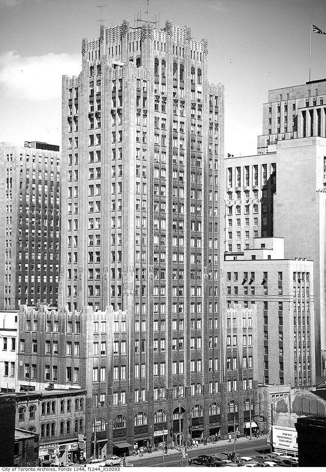
In the city of Metropolis, one building stands out from the rest. It’s a beacon of hope and a symbol of enduring truth—and it’s entirely fictitious. But the Daily Planet headquarters, where Clark Kent works as a reporter, is nevertheless a powerful reminder of all that newspaper buildings used to be. Crowned with an enormous globe, it’s the only true landmark in the skyline, symbolizing the paper’s cultural prominence. Legend has it that Superman co-creator Joe Shuster based its design on the former Toronto Daily Star headquarters, an imposing art deco structure that served as a constant reminder of the Fourth Estate’s presence in the city.
The functions of newspaper buildings, both symbolic and practical, have changed since theStar’s old building was razed in 1972. Where once they were monuments to the permanency and prestige of the papers they represented, today they project a humbler architectural image—one that reflects the state of an industry adjusting to a new, virtual reality. In 2016, The Globe and Mail will move several blocks east to a new building designed by the prestigious architecture firm Diamond Schmitt. And, just as old newspaper buildings tell us where the industry has been, new buildings like this one show us where it’s at, and where it’s headed.
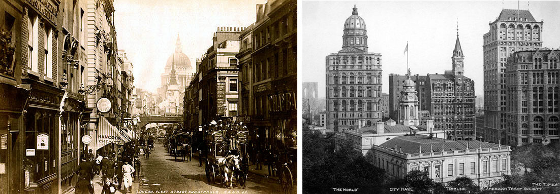
In the 19th and early 20th centuries, the placement of newspaper buildings was partly practical—they were usually close to city hall and big business. The Chicago Tribune was near the river for newsprint shipping purposes; The New York Times was by the subway so newsboys could collect bundles of papers from the basement printing press and take them uptown as quickly as possible. With every publication keen to be near the action, the buildings often formed “newspaper rows,” including London’s famous Fleet Street and Park Row in New York.

Left: London’s Fleet Street, around 1890 PHOTO: JAMES VALENTINE Right: Park Row, also knows as Newspaper Row, in New York around 1906 with The New York Times at right (PHOTO: THE TIMES PHOTO ARCHIVE)
The bustling downtown locations allowed newspapers to interact with readers. “If there was a race, or if there was an election—if you wanted to know right away—you hung around outside the newspaper buildings,” says Kathryn Holliday, an architecture professor at the University of Texas at Arlington. The building was the public face of the brand, and its architecture a form of marketing. Each rival paper wanted to “have a bigger and better and fancier skyscraper than the next guy,” explains New York University architectural history professor Carol Krinsky. Newspapers wanted to evince prestige, authority and, most importantly, newness. They wanted to capture the zeitgeist of the age, and their buildings to become cultural icons. Even the famous New Year’s Eve ball drop in Times Square was a marketing exercise—a way for Timespublisher Adolph Ochs to draw New Yorkers away from their traditional Wall Street gathering to his paper’s headquarters.
Canadian newspapers had similar ambitions. In 1938, the Globe moved into an art moderne building that was only a short walk from city hall. The streamlined structure, demolished in 1974, was adorned with bas-relief carvings; they depicted scenes from classical mythology, but were rendered in clean, art deco lines, symbolizing the paper’s vaunted history and bright future. The Toronto Star’s current home, built in 1971, features stark brutalist architecture, which was in vogue at the time. More tellingly: it stands at 1 Yonge Street, the start of the city’s most famous thoroughfare.

The old Toronto Star building on King Street West stood from 1929 until 1972 (PHOTO: CITY OF TORONTO ARCHIVES)
Today, Canadian newspaper buildings are remarkably varied in location and architectural style. The Gazette, in Montreal, is housed in an impressive Beaux-Arts building (designed by the Ross & Macdonald firm of Maple Leaf Gardens fame) on Saint Catherine Street, one of the city’s main downtown arteries. The Calgary Herald, which began in a tent at the junction of the Bow and Elbow rivers, and later occupied a downtown office building, is now located in a nondescript low-rise in a Calgary industrial park. The National Post (another Postmedia publication), moved out of its three-storey Don Mills location last month to take up five floors of a modernist office tower on Bloor Street East. It’s part of a cost-cutting plan that involves the Post selling its former headquarters to pay down its debt. The floors are not all contiguous—lengthy elevator rides between department floors are the cost of survival.
The Globe, meanwhile, is now located just west of downtown, in a three-floor building formerly home to the Toronto Telegram. The once-modern office seems dull today—such are the vicissitudes of taste—and some employees, including architecture critic Alex Bozikovic, who is looking forward to the move, say, “It’s not a particularly inspiring place to work.” Although the new building won’t project the old-world grandeur of The Gazette’s current home, it isn’t as stultifyingly bland as the Herald’s.
University of Toronto architecture professor Larry Wayne Richards says the Globe’s future home “seems to be nothing more than a generic office building in a not-very-special location.” (Indeed, the design was not conceived with the Globe in mind; the paper will have naming rights to the building but will occupy only the top five floors.) But according to Michael McClelland, principle of Toronto-based ERA Architects, it’s significant that the paper is staying downtown. Hard times have sent some papers to the suburbs, but the Globe still wants to interact with the surrounding city. “They want to communicate with Queen’s Park,” McClelland says. “They want to communicate with city hall; they want to communicate with business and industry”—and the building’s physical presence in the city will allow the paper to do that.
As in the old days, the new home presents a modern architectural branding opportunity, albeit a less tangible one. There are no carvings here, nor any gigantic globes rising above the cityscape. Instead, the design is environmentally friendly, and going green, says Krinsky, is a way for flagging newspapers to show they’ve adapted to life in the 21st century—that they’re still relevant. “If the building looks up-to-date and modern and progressive, it’s as if you’re alert to everything that’s happening in the world,” she says. “That sort of thing is meant to show that a newspaper is still part of a citizen’s life.”
Inside, staircases within the newsroom will make collaboration and moving between departments easier—an architectural expression of an industry that requires more from fewer employees. Outside, the Globe’s name will be at the top, 17 storeys up and towering over the shorter structures that surround it, ensuring that the paper’s presence will be felt in the city. Even in the digital age, newspaper buildings are a welcome sight in the urban landscape. “I think it’s really valuable that people commit to the city,” says McClelland. “This idea that we can do anything from anywhere—that it doesn’t matter where you are—is a problem.”
Graeme Bayliss was the Chief Copy Editor - Print for the Spring 2014 issue of Ryerson Review of Journalism.


